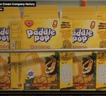
The colour of food packaging tells its own story
Do you want your product to look health-giving or decadent or economical? How do you convey this message to consumers when all they see is the packaging? The answer to this is through colour.
People make assumptions about products based purely on the aesthetics of the food packaging and after investigating this researchers from Kiel University have just published a paper in the Journal of Retailing — ‘Light and pale colors in food packaging: when does this package cue signal superior healthiness or inferior taste?’
Consumers’ reactions to pale packaging were investigated to see if the colour was associated with ‘healthy choice’ or ‘poor taste’.
The same herbed cream cheese was packed in two different colours: light green and regular green. Over a series of experiments it was established that light-coloured packaging contained ‘less tasty’ food. The more health-conscious consumers, however, also connected pale packaging with more healthy contents.
A conundrum then results — to appeal to health-conscious consumers pale packaging is beneficial. However, pale packaging is assumed to be less tasty and as food is purchased without tasting first, a darker pack colour may generate more sales.
The authors concluded: “Thus, when selling healthy foods to less health-aware shoppers, pale packages can have a deterrent effect. Employing darker tones could be one way to compensate for a perceived taste decrease.”
New rules for caffeinated products
Food Ministers have agreed to amend the Australia New Zealand Food Standards Code to introduce...
Australian National Campylobacter Action Plan, call to register interest
The action plan being developed to address the leading cause of bacterial foodborne illness in...
Olympic showcase of distinctively local produce set for 2032
'Feeding the Brisbane 2032 Games' white paper details how this event could showcase local...


